The Presentation That Changed Everything
Early in my career, I spent three weeks building what I thought was a brilliant analytics dashboard. It had every metric imaginable, interactive filters, drill-down capabilities, and real-time data feeds. When I presented it to the executive team, I watched their eyes glaze over within the first five minutes. The CFO finally interrupted me with a simple question: “What should we actually do differently based on this data?” I had no clear answer. That moment taught me that data without narrative is just noise, and it fundamentally changed how I approach every analytics project since.
Understanding the Data Storytelling Framework
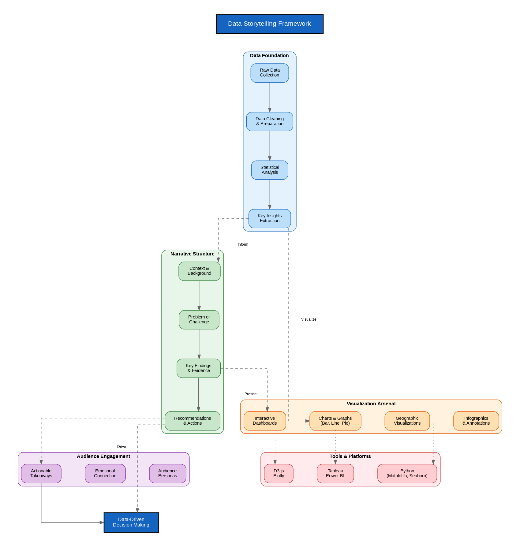
Data storytelling sits at the intersection of three disciplines: data science, visualization design, and narrative communication. After two decades of building analytics solutions for enterprises across industries, I have come to understand that the most impactful data presentations follow a consistent framework that transforms raw numbers into actionable insights that drive organizational change.
The foundation begins with solid data preparation. Raw data must be cleaned, validated, and transformed into meaningful metrics before any visualization work begins. This stage often consumes 60-70% of the total effort in any analytics project, yet it remains invisible to stakeholders. The quality of your story depends entirely on the integrity of your underlying data.
The Narrative Structure That Works
Every effective data story follows a narrative arc that mirrors traditional storytelling. You begin by establishing context, explaining why this analysis matters and what business question you are addressing. The conflict emerges when you reveal the gap between current state and desired outcomes, supported by data that quantifies the problem. The climax presents your key findings, the insights that emerge from careful analysis. Finally, the resolution provides clear, actionable recommendations that stakeholders can implement.
I have found that the most successful data presentations limit themselves to three key insights. More than that overwhelms the audience and dilutes the impact. Each insight should be supported by a single, well-designed visualization that makes the point immediately clear. If you need to explain what a chart shows, you have already lost your audience.
Visualization Selection and Design
Choosing the right visualization type is critical to effective data storytelling. Bar charts excel at comparing categorical data, while line graphs reveal trends over time. Scatter plots expose relationships between variables, and heat maps highlight patterns across multiple dimensions. The key is matching the visualization to the insight you want to convey, not forcing your data into a chart type because it looks impressive.
Context transforms a chart from decoration into communication. Every visualization should include clear axis labels, meaningful titles, and annotations that highlight the key takeaways. I always add a text callout that states the main insight in plain language, ensuring that even someone glancing at the chart understands the point immediately.
Tools and Technology Considerations
The modern data storytelling toolkit spans from code-based solutions like Python with Matplotlib and Seaborn to enterprise platforms like Tableau and Power BI. For quick exploratory analysis, I often reach for Python notebooks where I can iterate rapidly on visualizations. For stakeholder-facing dashboards that need ongoing maintenance, Power BI integrates well with Microsoft ecosystems while Tableau offers superior design flexibility.
D3.js remains the gold standard for custom, interactive web visualizations, though the learning curve is steep. For most enterprise use cases, the built-in capabilities of modern BI platforms provide sufficient flexibility without the development overhead of custom solutions.
Building a Data-Driven Culture
The ultimate goal of data storytelling extends beyond individual presentations. When done consistently well, it transforms organizational culture by making data-driven decision-making the default rather than the exception. Teams begin asking for data to support proposals, executives expect quantified impact assessments, and the entire organization develops a shared vocabulary for discussing performance and outcomes.
This cultural shift does not happen overnight. It requires consistent demonstration of value, where data stories lead to better decisions that produce measurable results. Each successful outcome builds credibility and appetite for more data-driven approaches across the organization.
Discover more from C4: Container, Code, Cloud & Context
Subscribe to get the latest posts sent to your email.
