Introduction
My intention with this article is to clarify the doubts among the .NET programmers having a misconcept about Windows Phone 7 and Metro.
When people first hear about METRO, they started believing that it’s a new programming language for Windows Phone 7 and they start referring to that in so many places.
What is METRO?
Metro is an internal code name for a typography-based design language created by Microsoft. It was created as a product of Microsoft’s user interface design work on Zune and Windows Media Center, for use in their mobile operating system Windows Phone 7. A specially made version of Microsoft’s Segoe font family, Segoe WP, is used as the main font family for all typographical elements.
METRO is a Design language or UI(User Interface) Guidelines, that defines how a Windows Phone 7 application should look like or set of design rules/standards Windows Phone 7 application developers/designers should follow.
Why we need such guidelines? Why can’t I develop it according to my wish?
A typical question to answer that let me explain a scenario, you cooked up some app(lets say “DemoApp”) and defined some styles and fonts according to your wish and you deployed the application on your “Windows Phone 7 Device”. When you start browsing your application and your found that design is not looking consistent across when your change themes or fonts on the phone. This makes you or the user feel that application looks like an alien from outer planet.
Why is that? To ensure consistency across the phone and to cope with user environment configurations, you need to have a standard defined. So that It will ensure the application will match with all changes to actual device.
Suppose you change “Back color” on the device, application should have a consistent looks matching to that back color. Similarly you are changing “Theme” color, and the application font and color should reflect the same theme changes.
Thus we have UI Guidelines or design guidelines, that tells your that these are the set of guidelines(for fonts, color, icons, images and layout etc) you need to follow to have an application that really suitable to “Windows Phone 7” environment. Follow guidelines or not is up to you..
How METRO was born?
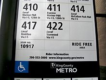
Microsoft’s design team says that the Metro UI is based on signs on the Metro rapid transit system in King County, Washington. Metro places a large focus on typography and features large text that catches the eye and runs off the page. Microsoft says that Metro is designed to be "sleek, quick, modern" and a "refresh" from the icon-based interfaces of Android and iOS.
All instances use fonts based on the Segoe font family designed by Steve Matteson at Agfa Monotype and licensed to Microsoft.
For the Zune, Microsoft created a custom version called Zegoe UI, and for Windows Phone 7, they created the "Segoe WP" font family; apart from minor differences the fonts are largely the same.
A Seattle Metro sign, from which the design language was inspired.
What are these guidelines?
The Metro design language is based on the following principles and guidelines that Microsoft provides for developers creating applicatons using the Metro design language:
Clean, Light, Open, Fast
- Feels Fast and Responsive
- Focus on Primary Tasks
- Do a Lot with Very Little
- Fierce Reduction of Unnecessary Elements
- Delightful Use of Whitespace
- Full Bleed Canvas
Celebrate Typography
- Type is Beautiful, Not Just Legible
- Clear, Straightforward Information Design
- Uncompromising Sensitivity to Weight, Balance and Scale
Alive in Motion
- Feels Responsive and Alive
- Creates a System
- Gives Context to Improve Usability
- Transition Between UI is as Important as the Design of the UI
- Adds Dimension and Depth
Content, Not Chrome
- Delight through Content Instead of Decoration
- Reduce Visuals that are Not Content
- Content is the UI
- Direct interaction with the Content
Authentically Digital
- Design for the Form Factor
- Don’t Try to be What It’s NOT
- Be Direct
and read more from references
Windows Phone 7 Series UI Design & Interaction Guide
Windows Phone Design System: Codenamed ‘Metro’
Windows Phone UI and Design Language. http://live.visitmix.com/MIX10/Sessions/CL14
Metro Design Language of Windows Phone 7
Future of METRO
The future of METRO is going to be interesting because Microsoft is going to follow the same steps in all their future products(Microsoft Office “15”, Windows 8 (leaked version demonstrates the METRO inspired interfaces in Windows 8), XBox and other releases are expected to follow the same guidelines).
So future of METRO is BIG guys..![]()
That is all for now buddies, thanks for reading through. Formulated with help of Wikipedia, I am reporting from HYDERABAD..
Discover more from C4: Container, Code, Cloud & Context
Subscribe to get the latest posts sent to your email.
