The most popular browser on the market now looks quite similar to its nearest competitors--Firefox and Chrome--dropping all clutter from its interface and slimming down to just a unified search and URL bar and a few simple menu buttons. In short, Internet Explorer 9 looks great in its new skin, but how does it measure up to Firefox 4 and Chrome? Let's take a closer look:
Measurements

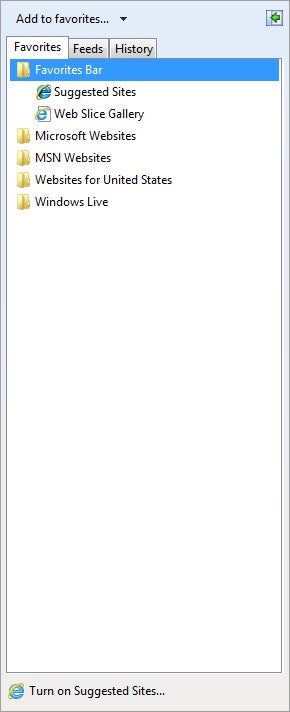
As you can see in the comparison screenshot (click to view), Internet Explorer 9 destroys Firefox in using vertical space, thanks to its clever placement of tabs (more on that shortly). IE 9 runs neck-and-neck with Chrome, but only if you hide Chrome's bookmarks bar. Because there's no other easy way to access Chrome bookmarks without opening a new tab--IE 9 has a dedicated button for viewing your favorites --I'd say Microsoft is the winner on room to browse.
Tab Placement
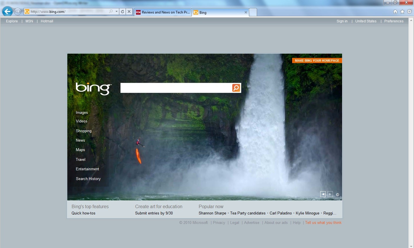
The biggest distinction between IE9, Chrome, and Firefox is how they position their tabs. Firefox's are above the address bar, and Chrome's are at the window's highest point, which I think is the ideal placement for fast access (you can push the mouse up to the top of the screen, while the other browsers make you land on a narrow strip). Still, I like Microsoft placed the tabs next to the search and URL bar (Zoom in on image). In practice this arrangement is not as claustrophobic as I imagined it would be, but it has one annoying flaw: The "X" button for closing tabs doesn't appear unless the tab is in focus, adding an extra step when you're trying to clear out unwanted pages.
Over the years, I've grown to love Chrome's single bar for addresses and searches, so I'm glad to see IE 9 adopt the omnibar (which Microsoft calls the One Box), with one big improvement: The right edge of the bar holds a drop-down menu that shows recent history and favorites (see image), plus a selection of search engines. Want to switch your default search engine from Bing to Google? All it takes is two clicks. (Yes, I'm aware Firefox has an omnibar add-on, but I can't test it until add-ons become available for Firefox 4.)
Menus
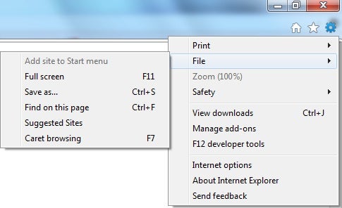
Both Firefox and Internet Explorer 9 have two menu buttons--one for bookmarks, and one for settings and functions like printing. I wish Chrome also had a bookmarks button to reduce the need for a dedicated bar. My vote goes to IE9 here, because the settings and bookmarks buttons are right next to each other, making for a cleaner interface than Firefox 4's scattered arrangement.
The Legacy
People who prefer Firefox's old interface will be happy to know they can essentially bring it back version 4 by clicking "Menu Bar" under settings. Internet Explorer users will have to adapt. Chrome's interface tweaks have been more subtle, but they're not customizable either.
IE9 not only catches up with its competitors, but improves in several areas. Obviously, there's a lot more to the browser wars than user interface--hardware acceleration, for example, will be a big draw for IE9--but look and feel are what you deal with the most in day-to-day browsing. IE 9 is still in beta, so its interface may change slightly before it's finalized, but Microsoft is off to a very good start.
In Video: A First Look at Internet Explorer 9 Beta
